Personal Trainer Website Design
Project Type
Website design | Logo design | Branding
Platform
WordPress | Illustrator
The Problem
Carrie, a personal trainer and health coach, came to us in need of a new website. While her current site, built with a do-it-yourself platform, was sufficient enough initially at the launch of her business, it did not have the functionality or personality it needed for her growing business. Coaching for Carrie had no logo or branding.
The Approach
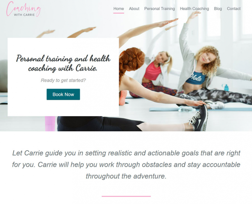
Carrie disliked many of the fitness websites she saw. They were dark and intimidating. She was looking for something soft and friendly – a site that would appeal to fitness newbies wanting to take the first step in living a healthier lifestyle.
The Solution
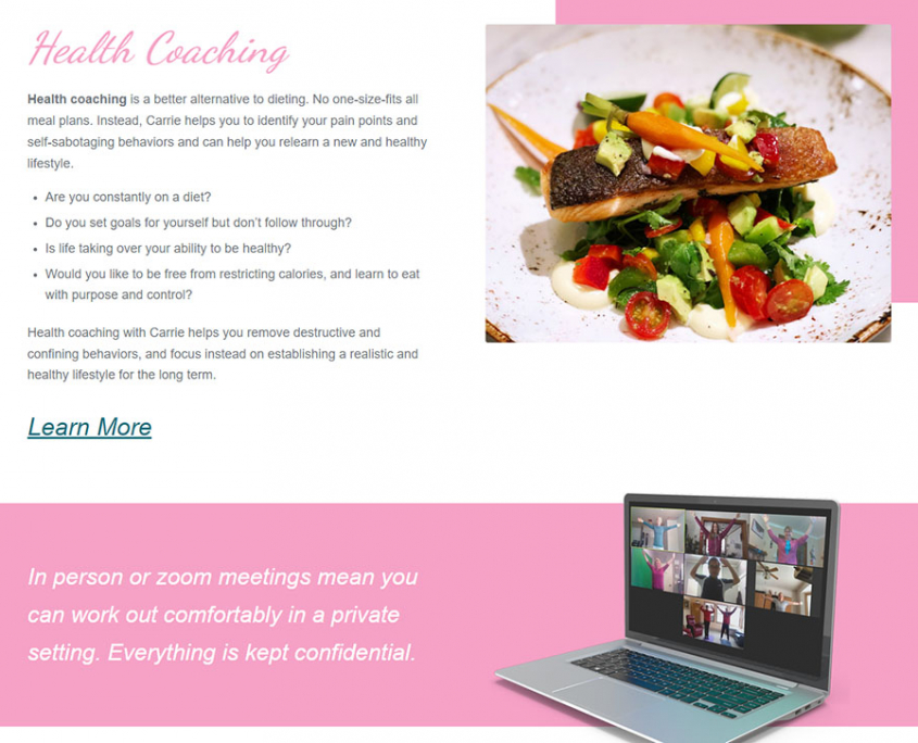
We chose one of the friendliest and least intimidating colors, a soft pink, as the dominant color. An energizing teal complimented the pink, and we incorporated neutral greys and white to keep the look light.
The shoe, representing fitness, was chosen for the logo. The angle of the shoe signified action while the soft curves kept with the friendly theme.
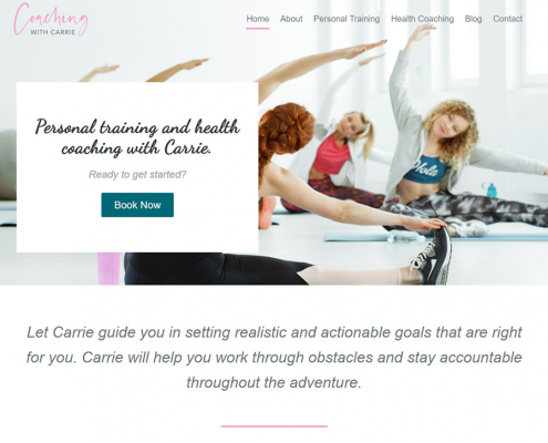
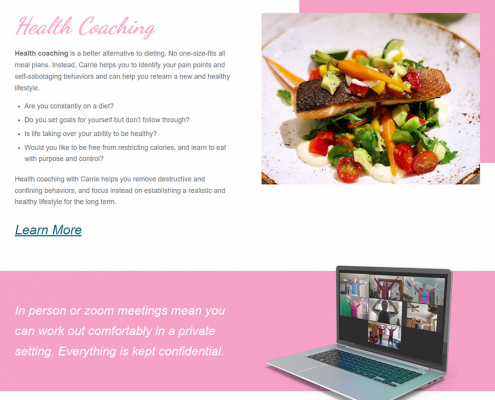
The homepage messaging and call-to-action “above the fold” told the visitor what Carrie’s services were and how to request them. A scroll down the homepage elaborated on Carrie’s services and what to expect. Testimonials and encouraging messages and images lead to a contact form at the bottom of the page. The main menu is simple so as to not overwhelm the potential new client interested in embarking on this health journey. Here they could learn more about Carrie, her services, read her blog and contact her.
The Result
The site has the friendly look Carrie had envisioned.
Are you a new business in need of a look that fits your uniqueness and makes you stand out? We offer branding, logo design, website design and more. Shoot us a message and tell us your story.
